San Aerospace India Pvt. Ltd. (San Aero) manufactures high-precision gears, assemblies, and machined components for global OEMs across the oil & gas, mining, and aerospace industries. As the company evolved from SANAUTO into a dedicated aerospace manufacturer, First Branding Agency led its rebrand a new logo, brand guidelines, and corporate identity that carry five decades of engineering trust into an aerospace future, while keeping a refined nod to the gear that built the company.
San Aero isn’t selling to consumers it’s selling to global OEMs in the United States, Germany, the UK, and Australia, in sectors where a single out-of-tolerance component is a catastrophic failure. Founded in 1988 and generating over 95% of revenue from exports, it’s a serious, established engineering company that had grown into the aerospace sector the most quality-critical manufacturing there is.
The branding challenge for a company like this is the opposite of a consumer brand’s. There’s no impulse to capture, no shelf to win. The identity has one job: signal precision, reliability, and engineering credibility at first glance, to procurement teams and quality auditors at international aerospace firms the kind of buyers who also want to see AS 9100 and ISO 9001 certifications before they trust a supplier.
The company came to us as SANAUTO the name and identity it had operated under as an auto-components and engineering firm. The old logo was a plain white sans-serif wordmark with a literal grey gear icon and a small red underline.
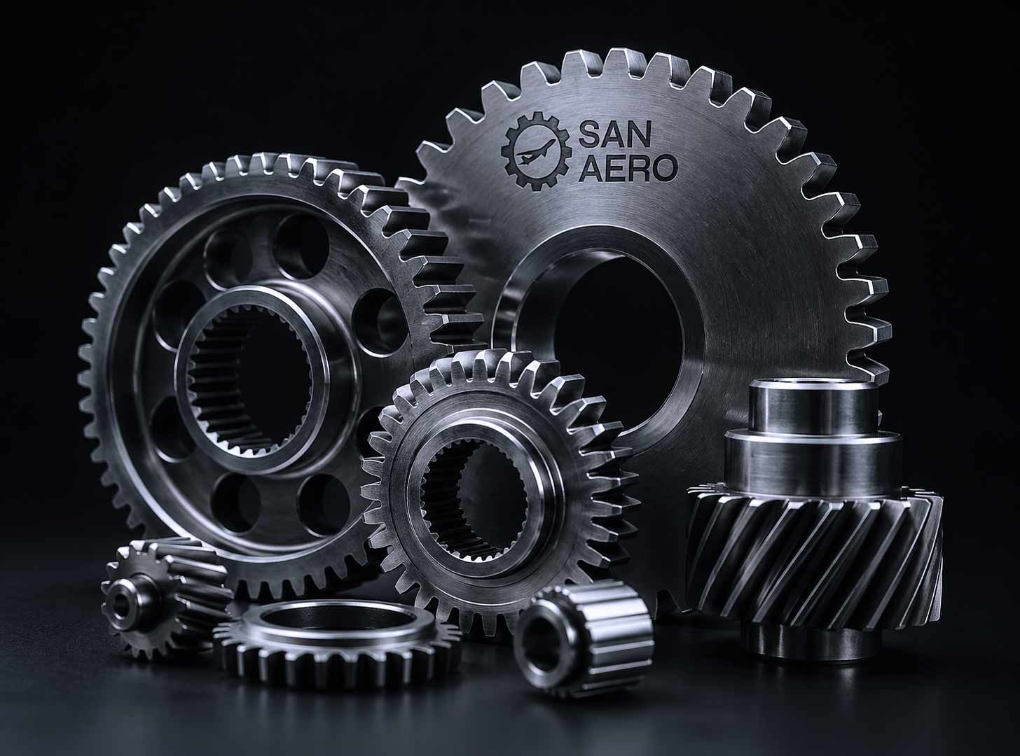
It wasn’t a bad logo. It was an accurate one for who the company used to be. The gear said “we machine parts,” which was exactly right for an auto-engineering business. But the company had made a strategic move into aerospace, manufacturing critical components for global OEMs and a literal cog now undersold them. To an aerospace procurement team, it read as a general engineering shop, not a precision aerospace supplier. The name change from Sanauto Engineers (India) to San Aerospace India Pvt. Ltd. marked the shift; the identity needed to catch up.
The rebrand brief, then, wasn’t “start over.” It was harder: carry the trust and heritage built since 1988 into a new category, without throwing away the equity in what already existed.
For a B2B manufacturer exporting to aerospace OEMs, every brand decision answers to one question: does this make a quality auditor trust us? That reframes the whole project:
1. The audience is technical and international engineers and procurement managers, not the public. The identity has to read as competent and exacting across cultures.
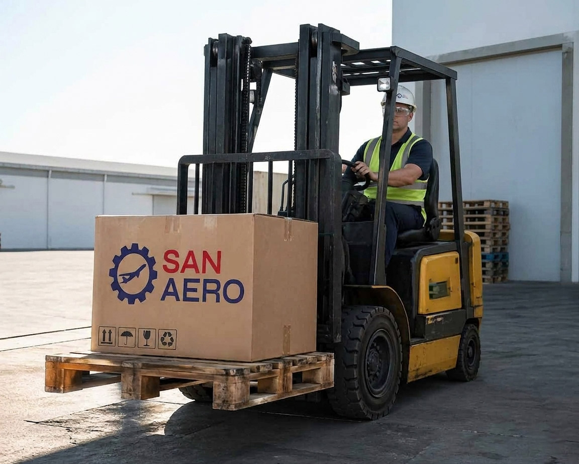
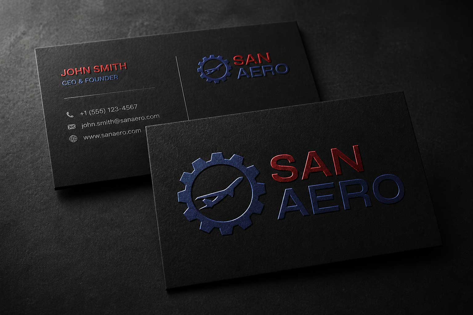
2. The brand lives on technical documents, certifications, machined-part tags, trade-show stands, and email signatures not packaging or social feeds. It has to hold up small, in mono, and on a spec sheet.
3. The visual language of precision, aerospace, and engineering clean geometry, exactness, restraint does more work here than colour or personality.
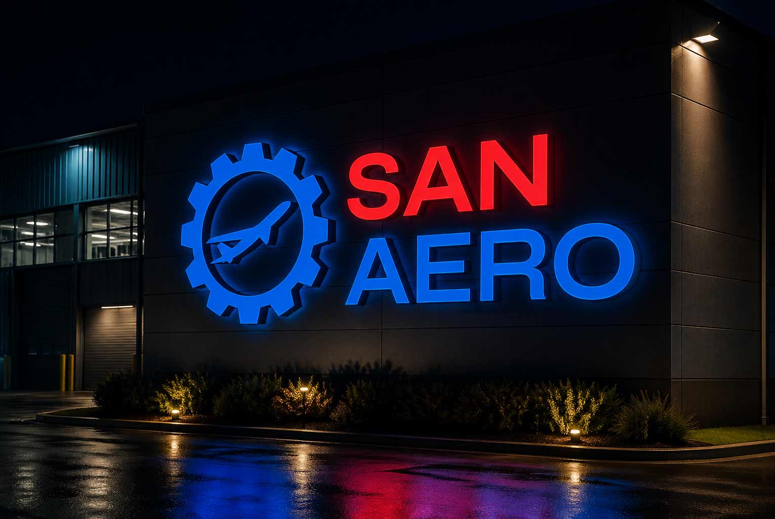
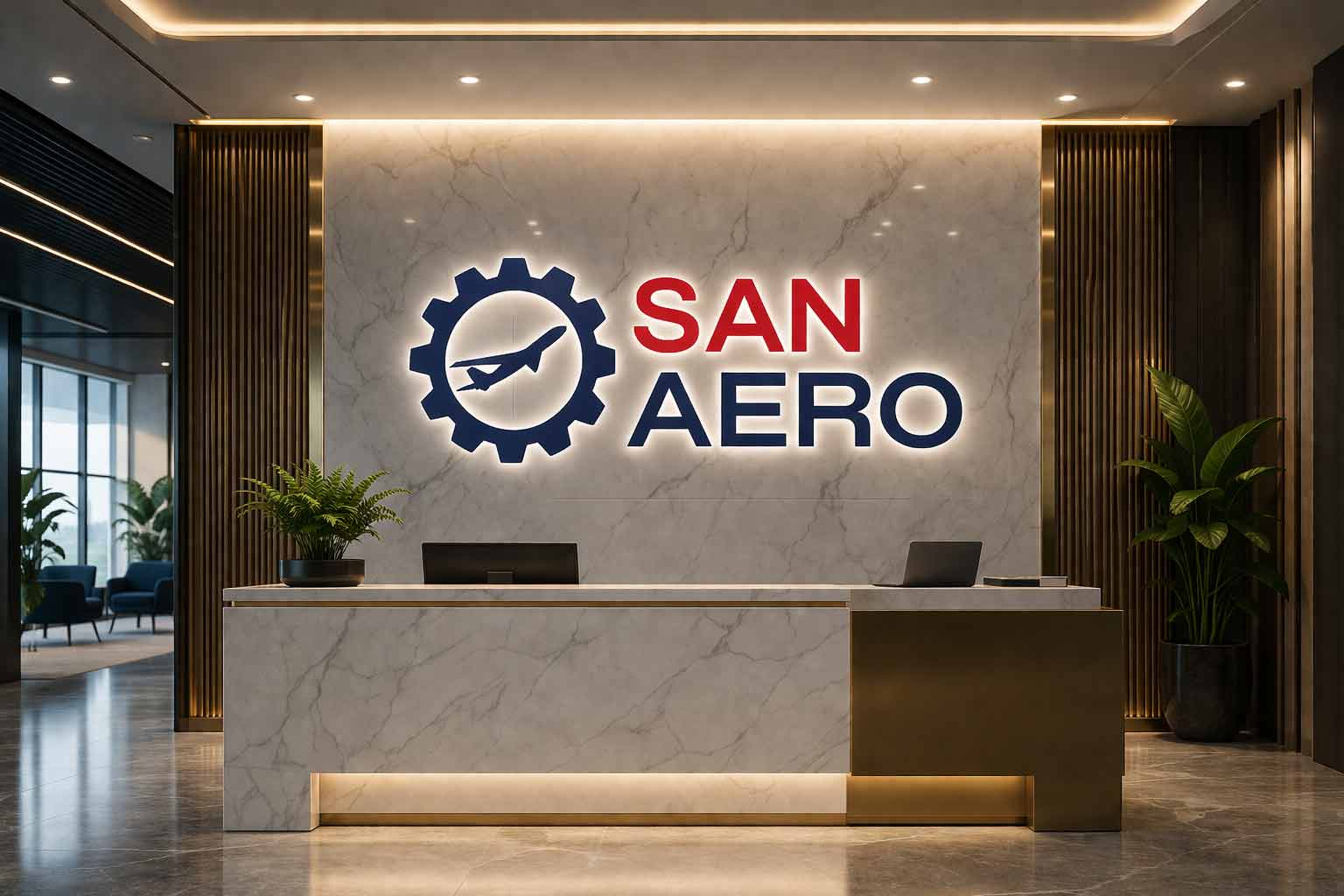
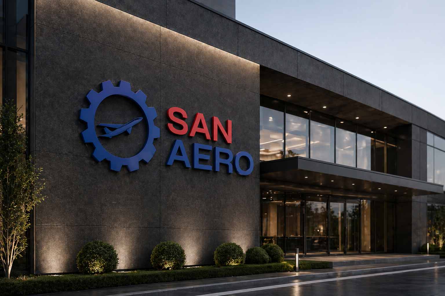
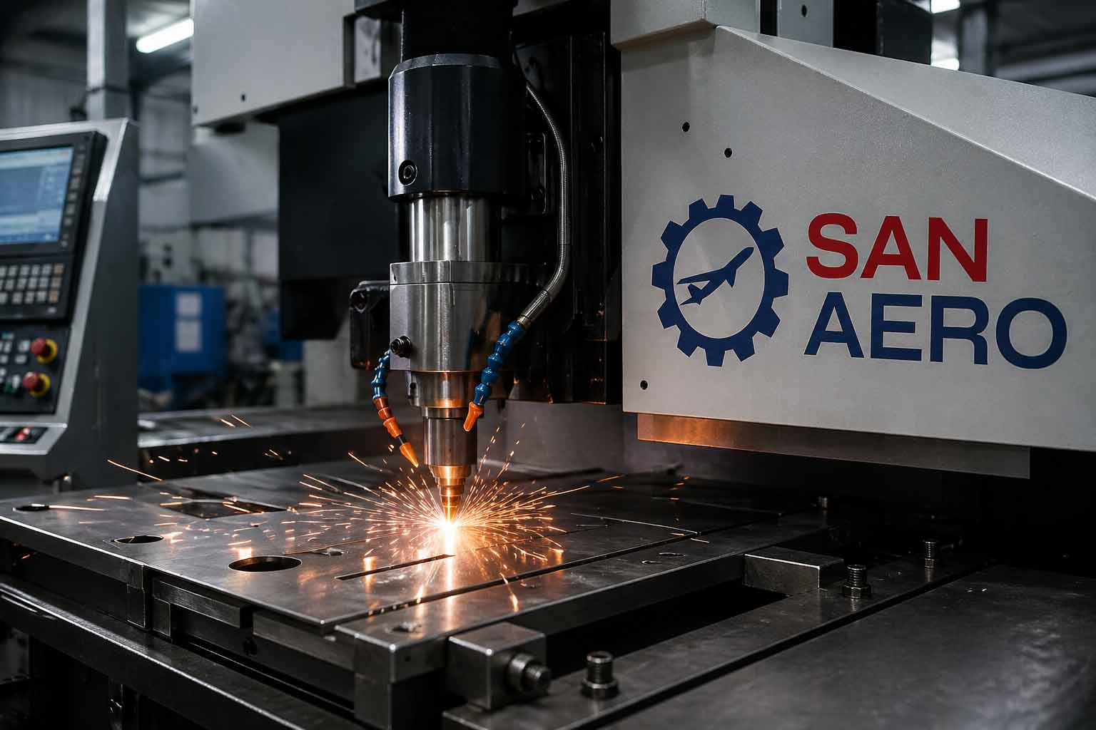
The logo: evolving the gear, not deleting it. The most important decision was what to do with the old gear icon. Dropping it entirely would have thrown away decades of recognition; keeping it as-was would have kept the company stuck in its auto-parts past. So we did neither we refined the gear into an aerospace cue, keeping the thread of continuity while shifting what it signals from “machine shop” to “precision engineering.” A returning customer still recognises the lineage; a new aerospace OEM reads precision and modernity.
The system. The complete brand guidelines cover logo construction and clearance, colour codes for print and digital, typography, and corporate identity applications so a global manufacturer can present one consistent, credible brand across every market and document, from a quotation in Germany to a part tag on a US OEM’s line.
The clearest way to see this rebrand is side by side: the original SANAUTO logo, built for an auto-components business, evolved into the new San Aero aerospace identity.
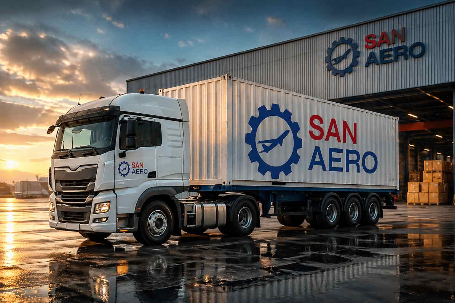
Logo design, brand guidelines, and corporate identity a complete, consistent identity system for an export-focused aerospace and precision-components manufacturer.
The company evolved from an auto-components and engineering firm into a dedicated aerospace manufacturer (renamed San Aerospace India Pvt. Ltd.). The original SANAUTO identity, with its literal gear icon, signalled general engineering rather than precision aerospace — so the rebrand repositioned the company for global aerospace OEMs while preserving the trust it had built since 1988.
A B2B manufacturer isn’t competing for impulse attention it’s earning the trust of technical buyers and quality auditors at global OEMs. The identity prioritises precision, credibility, and consistency across technical documents and certifications over personality or shelf appeal.
Yes. First Branding Agency designs brand identities for manufacturers, engineering firms, and industrial exporters building identities that signal reliability and quality to international, technical audiences.
Yes. For quality-critical sectors like aerospace, the identity and corporate collateral are designed to present certifications and credentials clearly, since they are central to how technical buyers evaluate a supplier.
San Aero (San Aerospace India Pvt. Ltd.) is an export-focused manufacturer of precision gears, assemblies, and aerospace components serving global OEMs since 1988. First Branding Agency, a branding agency in Faridabad, led its rebrand from SANAUTO evolving a literal auto-parts gear icon into a refined aerospace cue, and delivering a new logo, brand guidelines, and corporate identity that signal precision and credibility to demanding international buyers while preserving decades of engineering heritage.
