Ibaa-boo! is a kids-focused, ready-to-eat nutrition brand making healthy eating fun, safe, and convenient for children up to 8 years. First Branding Agency designed Ibaa-boo’s complete brand identity from Faridabad: logo, visual identity, brand guidelines, and corporate identity, built to feel playful to kids and trustworthy to parents at the same time.
Most brands speak to one customer. Ibaa-boo has two, and they want opposite things.
Children respond to colour, play, and fun. Parents are the actual buyers, especially health-conscious, time-pressed mothers of infants to 8-year-olds. They are scanning for safety, hygiene, clean labels, and trust.
Challenge: A kids’ food brand that’s all playful looks unsafe to a parent. One that’s all clinical trust looks boring to a child.
That tension defined the entire project. In our discovery session, the founders put it plainly: the brand had to feel nutritious, safe, playful, parent-trusted, and baby-approved all at once.
Ibaa-boo enters a category with serious incumbents such as Slurrp Farm, Happa Foods, Timios, and Bebe Burp. These brands already own shelf space and parents’ attention in urban India. A me-too identity would disappear next to them.
Every First Branding project starts with a structured brand discovery questionnaire before any sketching. For Ibaa-boo, discovery defined:
1. Mission: make healthy eating fun, safe, and convenient for children, while supporting parents with trustworthy ready-to-eat food.
2. Core values: nourishment, trust, joy, convenience, and (long-term) sustainability.
3. Audience: primary: parents of children up to 8, urban and semi-urban India; busy, health-conscious, convenience-seeking.
4. Visual direction: a wordmark plus a playful icon; warm pastels, sunshine yellow, sky blue, soft green, and coral; rounded, kid-friendly typography. And a clear “avoid” list: black-heavy, grey, or corporate-serious tones.
This is why we don’t skip discovery: the founders’ own answers became the design brief, and every decision after it could be tested against them.
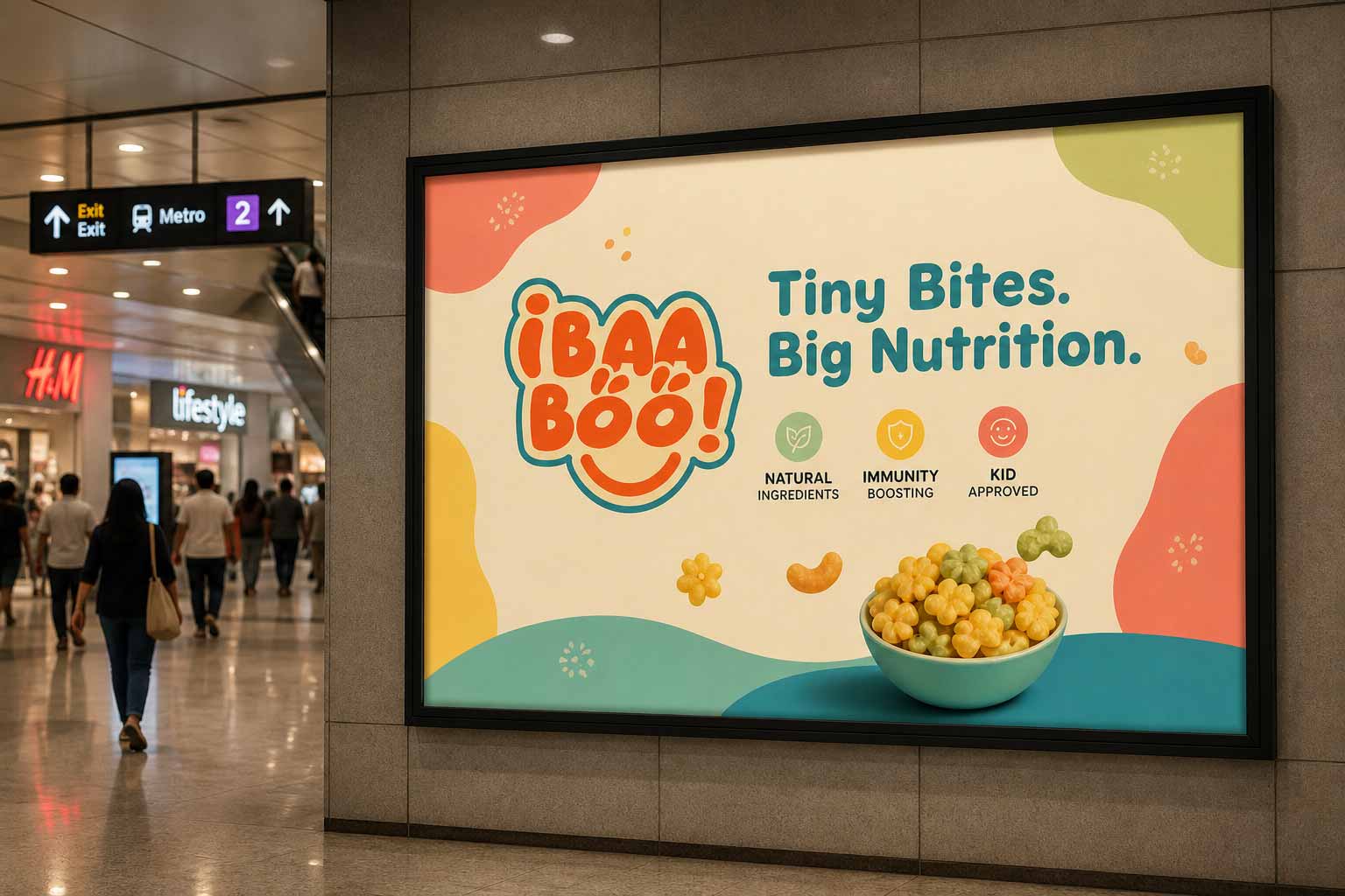
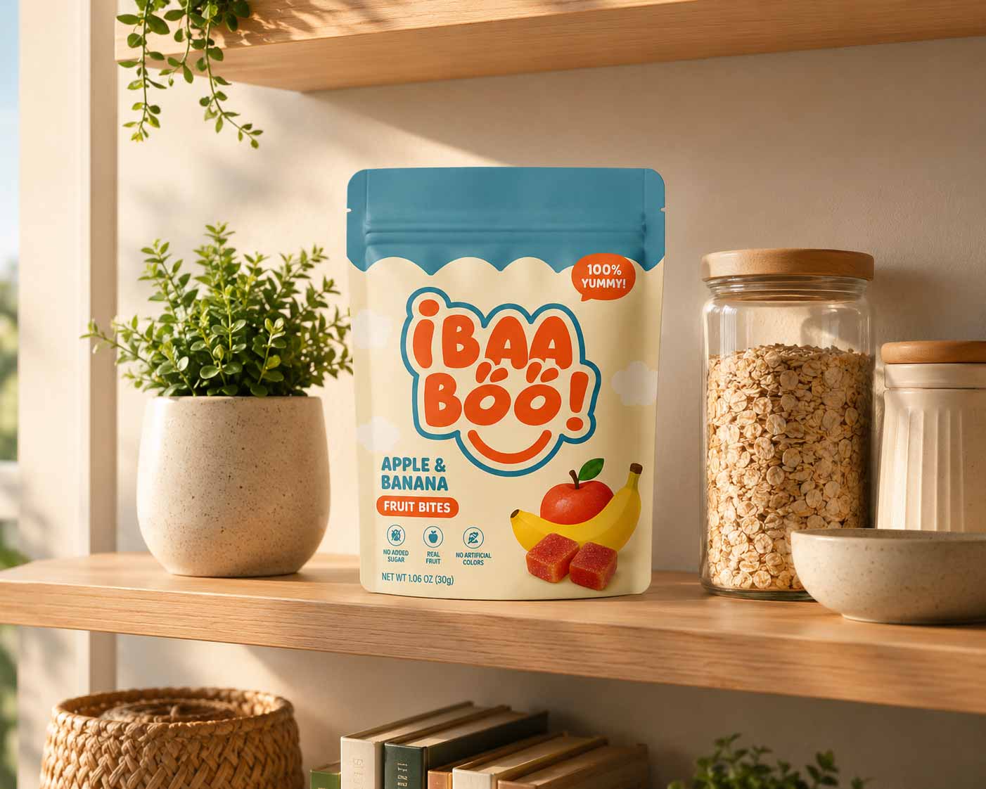
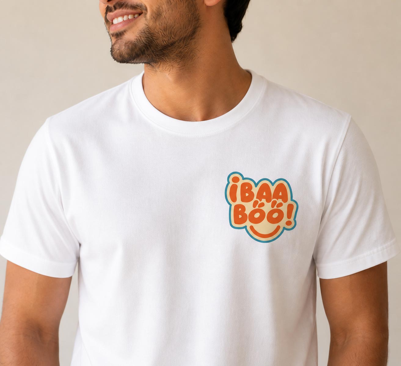
The logo. The brief asked for a wordmark with a playful icon. And that’s exactly what we delivered. The logo designed is playful yet clean and readable.
Colours: A four-colour system warm orange #EB5A28 (RGB 235, 90, 40) as the lead brand colour, soft cream #FFE3A8 (255, 227, 168) as the warm background tone, deep teal #0F5B67 (15, 91, 103) and soft teal #50A2A2 (80, 162, 162) as the grounding/trust colours, plus white and black for utility.
Typography: Momentz, customized, as the logo font: it gives Ibaa-boo! a playful, friendly feel reflecting joy, trust, and a caring approach to kids’ nutrition.
Brand guidelines. Because Ibaa-boo’s roadmap includes packaging, flyers, a website, and social media, we documented the identity as a complete brand guideline system. This includes logo usage and variations, clear-space rules, colour codes for print and digital, typography hierarchy, and do’s and don’ts so the brand stays consistent as it scales across every format a ready-to-eat food brand needs.
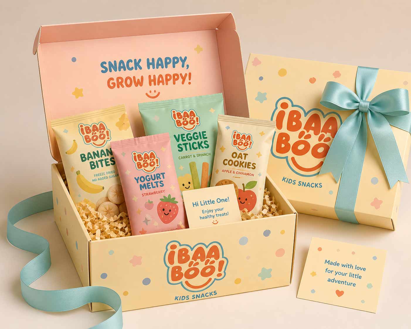
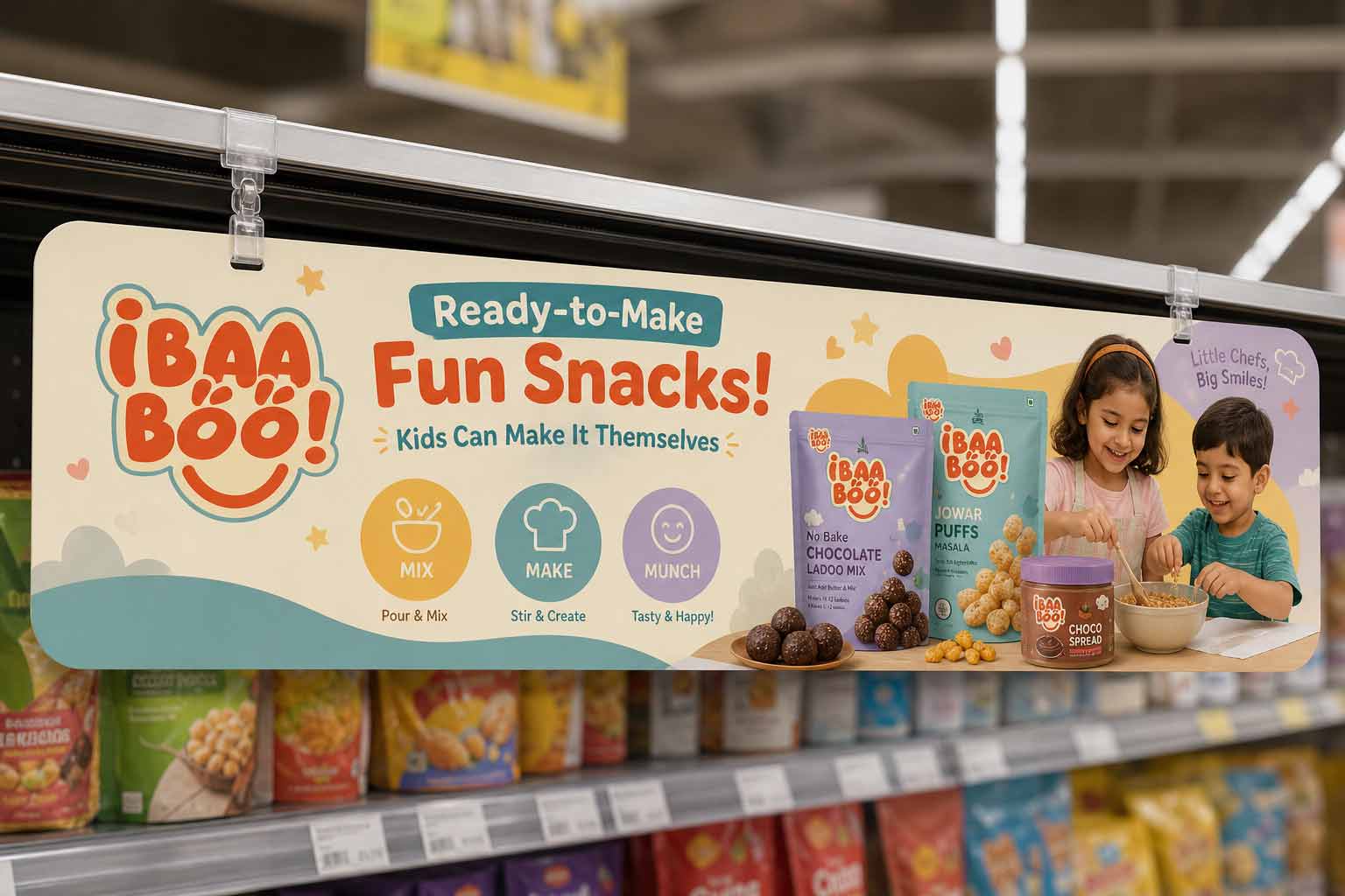
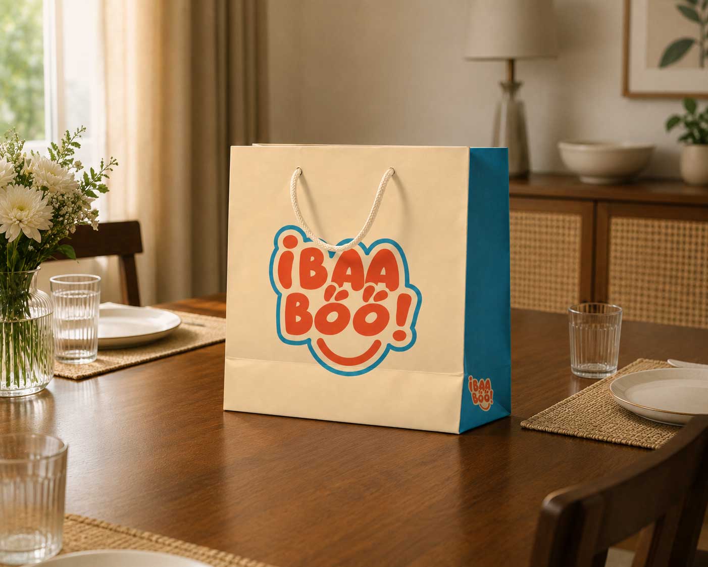
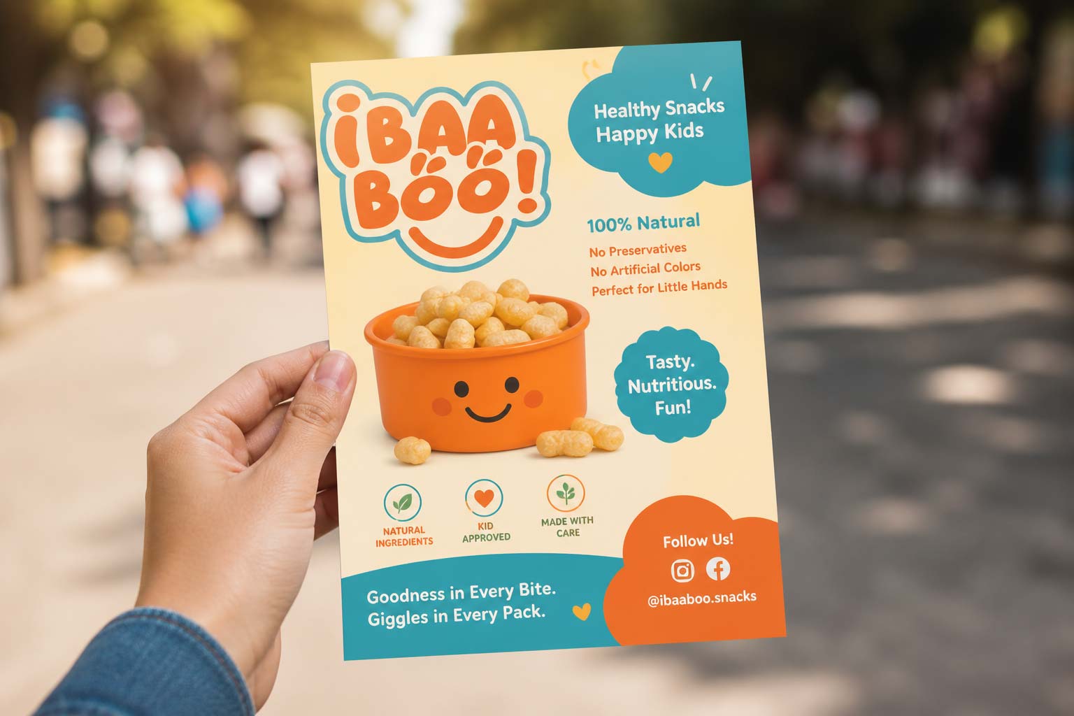
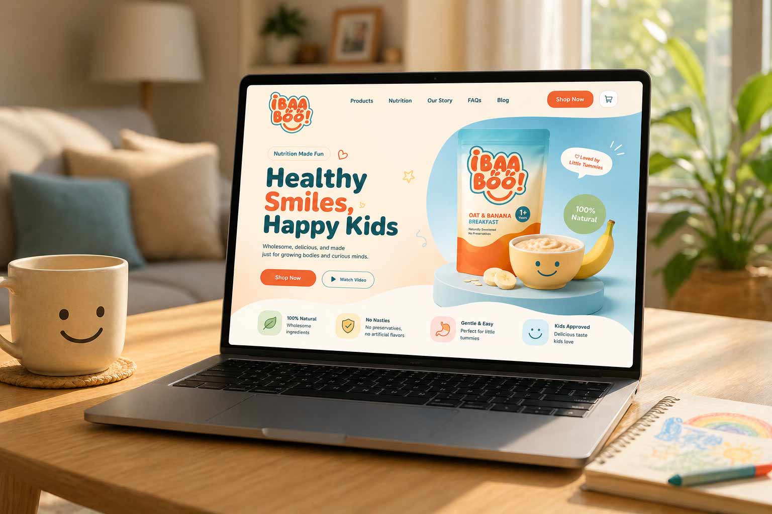
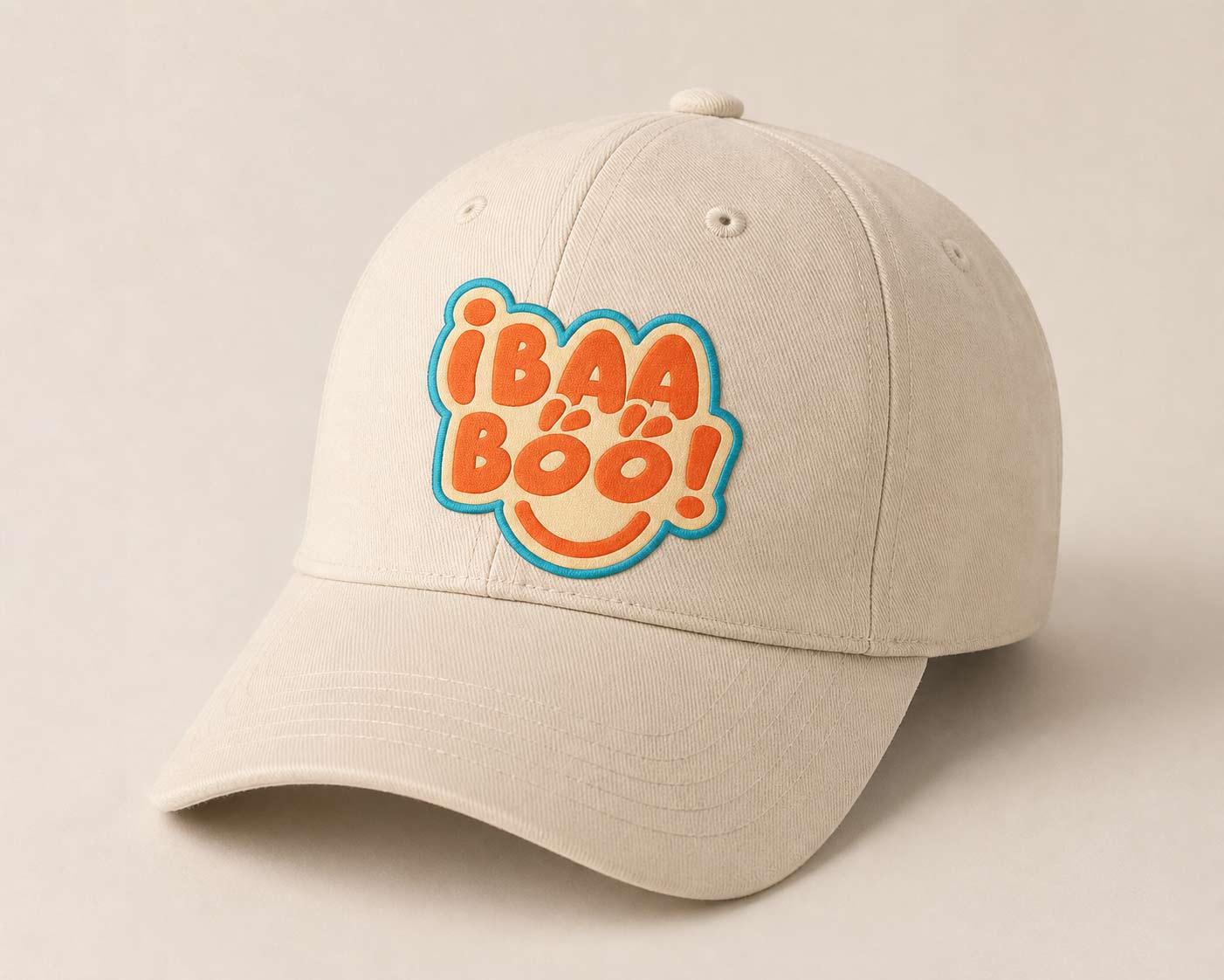
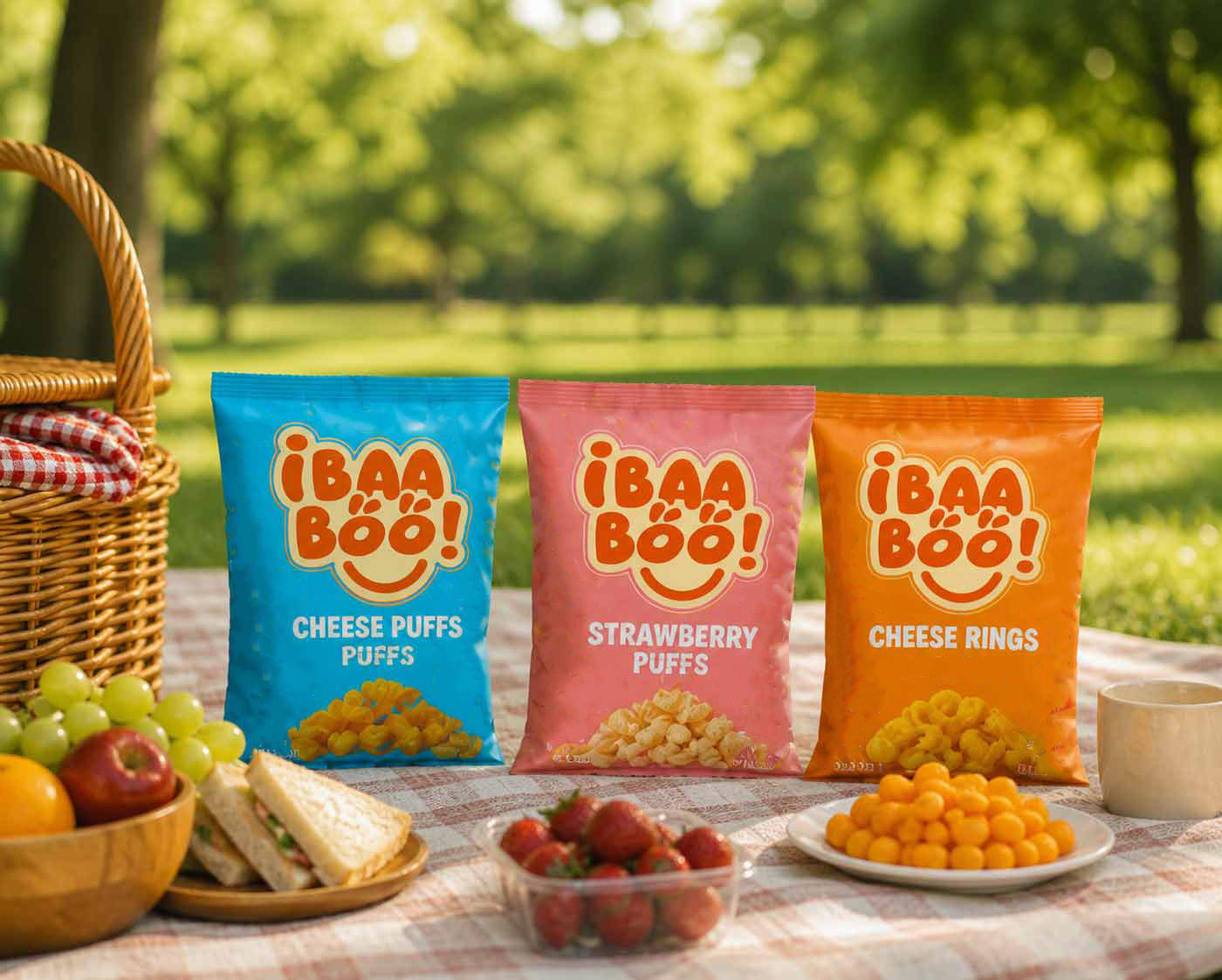
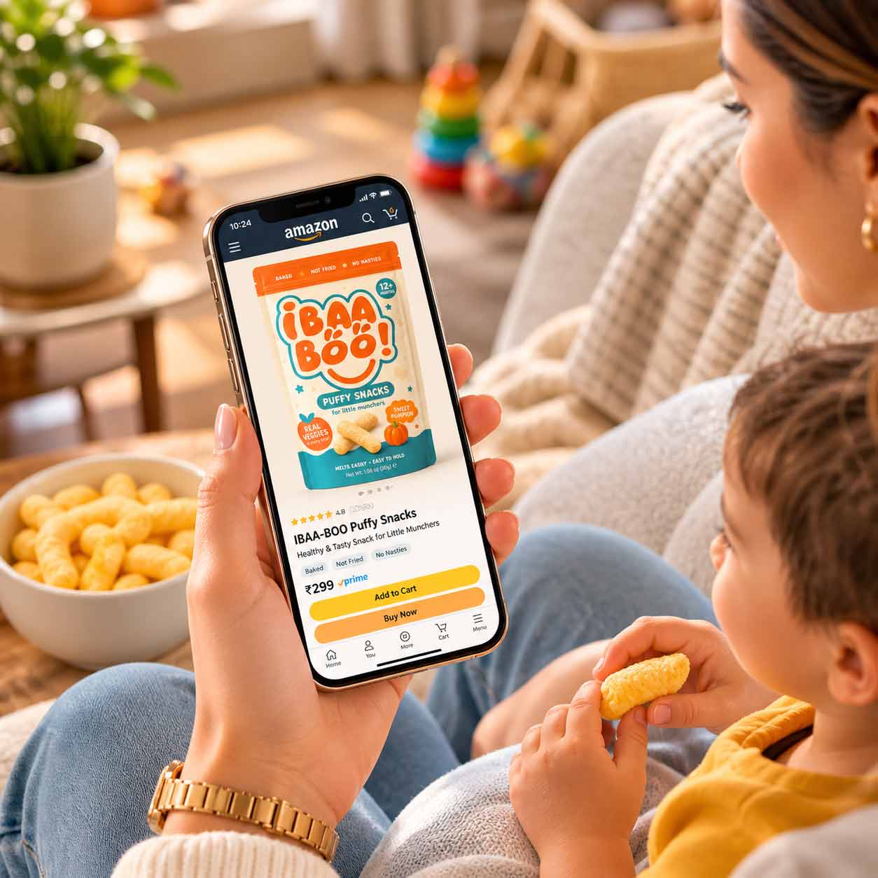
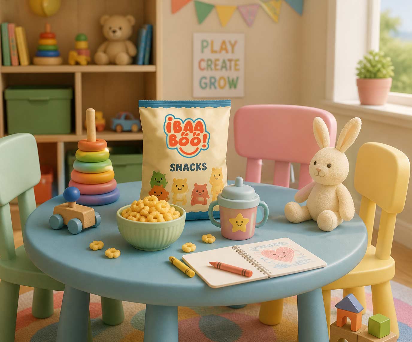
Logo design, complete visual identity, brand guidelines, and corporate identity. The identity system was built to extend into packaging, flyers, website, and social media templates as the brand scales.
It must persuade two audiences with opposite instincts: children, who respond to play and colour, and parents, who buy on trust, safety, and clean labels.
Every project begins with a structured brand discovery questionnaire covering mission, values, audience, competitors, and visual preferences. The client’s answers become the design brief, so every concept can be evaluated against agreed criteria instead of taste.
Yes. First Branding Agency designs packaging for food, FMCG, and consumer brands in Faridabad and across Delhi NCR-from structure concepts to print-ready artwork. Packaging was a stated priority on Ibaa-boo’s roadmap, and the identity system was built to support it.
Ibaa-boo is a ready-to-eat kids’ nutrition brand competing against established names like Slurrp Farm and Timios. First Branding Agency, a branding agency in Faridabad, designed its logo, visual identity, brand guidelines, and corporate identity around one core challenge: feeling playful to children while signalling safety and trust to parents. The project started with structured brand discovery, and the resulting guideline system is built to scale into packaging, web, and social formats.
