BHU Elements is a knowledge platform that simplifies real estate for aspiring entrepreneurs and enthusiasts across India through a YouTube channel and an upcoming app built on facts, clarity, and practicality. First Branding Agency designed its complete brand identity: a bilingual logomark built on the Hindi letter भू, brand guidelines, brochure, and corporate identity that root a digital-first brand in the earth its name comes from.
“Bhu” is a Sanskrit root word meaning Earth, paired with “Elements,” the name signifies the essential aspects of the planet, captured in the tagline the founders brought with them: “We owe to Mother Earth.”
But BHU Elements isn’t a farming or eco brand. It’s a digital knowledge platform educational real estate videos on YouTube, with an app on the roadmap aimed at every Indian with an internet connection who wants to understand property without the jargon. So the identity had to do something unusual: make a screen-native content brand feel grounded, traditional, and trustworthy the qualities of earth itself while staying clean enough to work as a YouTube avatar and an app icon.
One more constraint sharpened everything: the client came to us with no competitor references and no logos they liked. No mood board to lean on. The identity had to be built from the name, the meaning, and the discovery conversation alone.
Our structured brand discovery questionnaire defined the foundations:
1. Mission: get the real facts of real estate across in the easiest, most engaging way; empower viewers to navigate property decisions with confidence.
2. Audience: pan-India: anyone with internet and social media access interested in quality real estate content, with budding entrepreneurs at the centre.
3. Logo direction: founders asked for the Hindi word भू as the mark, with “Bhu Elements” beside it and specifically loved the idea of भू drawn by hand, so it would feel crafted rather than typed.
4. Colour direction: yellow, brown, orange, and green stability, grounding, nourishment, unity. And one hard exclusion: no red.
5. Geometry: the brief named squares, rectangles, circles, and triangles as the brand’s shape language.
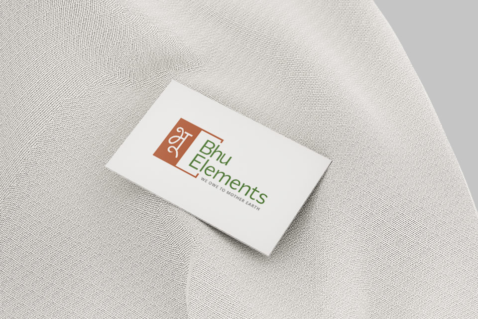
The logomark. The concept is simple enough to describe in one line and that’s its strength: the hand-drawn Hindi letter भू set in a geometric square, paired with a clean sans-serif wordmark. The square delivers the stability the brief asked for; the hand-crafted भू delivers the human warmth the founders specifically requested. Half the square is filled in rust orange holding the white भू, while the other half opens into an outlined bracket the mark reads as both a solid foundation and an open frame, fitting for a brand built on making real estate knowledge accessible.
The bilingual structure does real work too: भू carries the Sanskrit meaning and Indian identity, while the English wordmark keeps the brand readable across a pan-India digital audience.
The colour system. The founders asked for earth; the palette answers with it and respects the “no red” line by choosing rust the colour of terracotta and soil, not alarm. Rust Orange #B34A1D is the lead colour, symbolising earth, tradition, and grounding. Earthy Green #3F721F represents growth, stability, and nature, used as the wordmark colour. Grey #606060 brings simplicity and sophistication, used for the tagline and supporting text.
Typography. The logo wordmark is set in Caregold, chosen for its premium character this is a brand positioning itself as the authoritative voice in its category, not a casual creator channel. Supporting it, the guidelines establish Poppins (thin through black) and Lato (hairline through black) as the working typefaces modern, highly legible sans-serifs that perform on the surfaces where this brand actually lives: video thumbnails, subtitles, app screens, and social graphics.
The system. The full guideline document covers logo construction, a horizontal lockup for wide formats like video end-cards, colour codes for print and digital, clearance rules, and misuse examples so the identity survives the place brands most often fall apart: daily content production at YouTube pace.
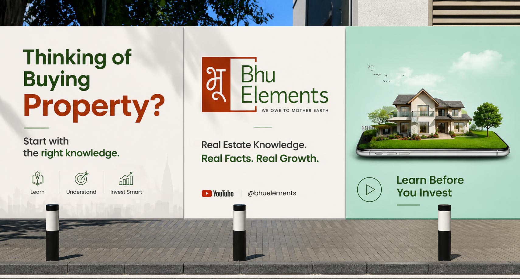
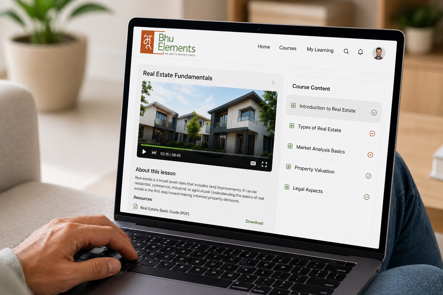
The result is a complete, ready-to-use identity system for BHU Elements logomark, colour palette, typography, brochure, and corporate stationery built to roll out consistently across the brand’s YouTube channel and its upcoming app, giving the founders a grounded, trustworthy foundation to build their content and audience on from day one.
Logo design, brochure design, brand guidelines, and corporate identity a complete identity system built to extend to the brand’s YouTube channel and upcoming app.
“Bhu” is a Sanskrit root meaning Earth, and the founders wanted that meaning visible so the hand-drawn Devanagari भू became the mark itself, paired with an English wordmark for pan-India readability across digital platforms.
The BHU Elements brief included no reference logos or competitors, so the identity was built from structured discovery instead: the name’s meaning, the founders’ colour and shape instincts, the audience, and the brand’s mission. Discovery answers became the design brief.
Yes. First Branding Agency designs brand identities for content platforms, education brands, and digital-first businesses across India identities built to stay consistent at the pace of daily content production.
BHU Elements is a real estate knowledge platform YouTube now, app next — whose name means Earth in Sanskrit. First Branding Agency, a branding agency in Faridabad, designed its complete identity around a hand-drawn भू logomark in a geometric square, an earthy rust-green-grey palette honouring the client’s “no red” rule, and a Caregold–Poppins Lato type system documented in full brand guidelines. With no competitor references provided, the entire identity was built from structured brand discovery.
