First Branding Agency built the complete brand identity for Hi Rise Builders, a construction, architecture, and engineering firm operating pan-India since 1992, covering logo, brand guidelines, corporate identity, construction site hoardings, space branding, and marketing material. This case study covers a scope most branding case studies don’t: an identity system built to work at the scale of an active construction site, not just a screen or a business card.
Hi Rise Builders isn’t a new company trying to earn its first client. It’s an established construction, architecture, and engineering firm with decades of delivery behind it, working across dozens of cities for large, recognizable clients. That scale is exactly what makes brand consistency hard. A company running concurrent projects across 25+ cities has dozens of site teams, vendors, and contractors touching its brand at once, and every one of them is a chance for the identity to drift.
The identity also had to carry a specific, harder-to-fake claim: single-point-of-accountability across construction, architecture, and engineering, delivered under one roof rather than stitched together from separate vendors. A brand that looks fragmented undercuts that exact pitch.
| Deliverable | What It Covered |
|---|---|
| Logo | Core mark and visual identity foundation; see the Logo Design Agency in Delhi and Branding Agency in Delhi pages for the design detail |
| Brand guidelines | Documented rules for logo usage, color, typography, and application across every touchpoint below |
| Corporate identity | Stationery and internal-facing identity assets used across offices and project teams |
| Construction site hoardings | Branded signage at active project sites: the identity’s highest-visibility, highest-volume application |
| Space branding | Applying the identity to Hi Rise Builders’ own office environment |
| Marketing material | Client-facing collateral supporting business development and project pitches |
The logo and core visual identity for Hi Rise Builders were designed to signal structural trust and scale at a glance. The full design rationale is covered on First Branding Agency’s Logo Design Agency in Delhi page. Everything in this case study, guidelines, corporate identity, site hoardings, space branding, and marketing material, was built as an extension of that same mark, not as separate design exercises.
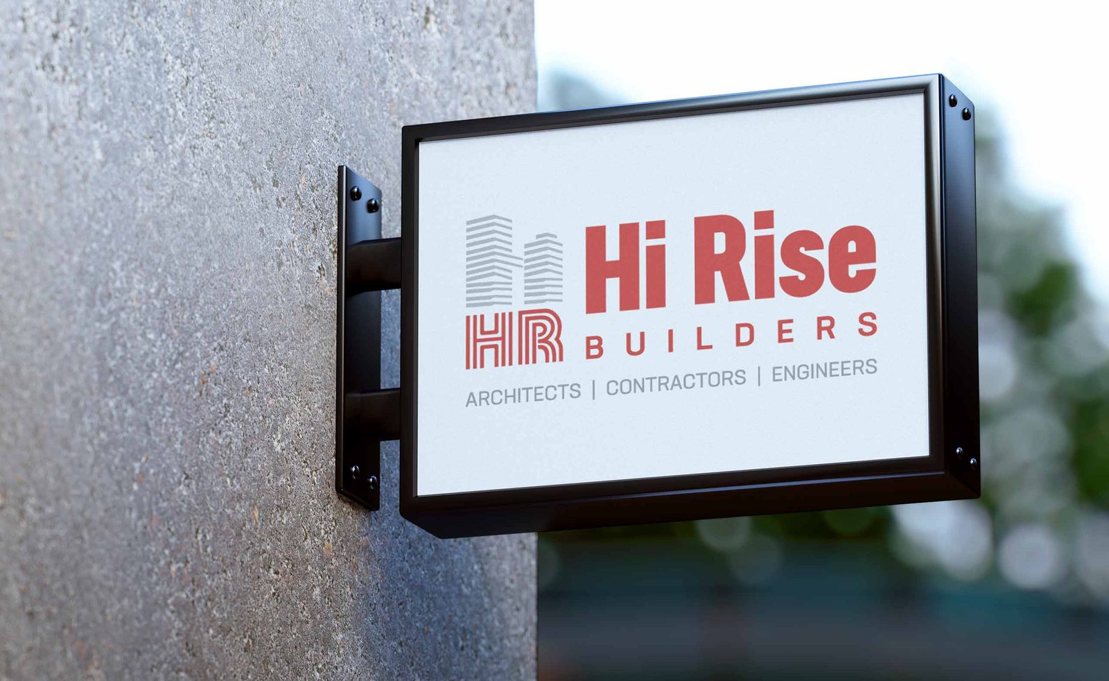
Brand guidelines matter more for a pan-India construction firm than almost any other business type, because the brand has to be applied correctly by people who never sit in the same room as the design team: a site supervisor ordering a hoarding in one city, a procurement team reordering letterheads in another. Without a clear rulebook, an identity that looks sharp in Delhi ends up inconsistent everywhere else.
For Hi Rise Builders, the guidelines set fixed rules for logo usage, color, and typography so the brand holds together whether it’s applied by the Delhi office or a site team several states away.
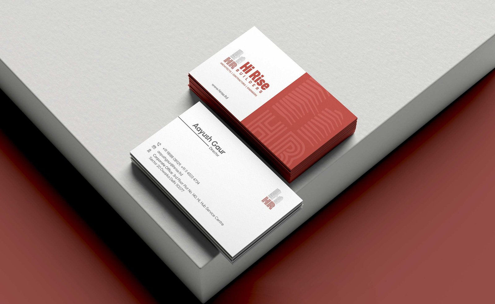
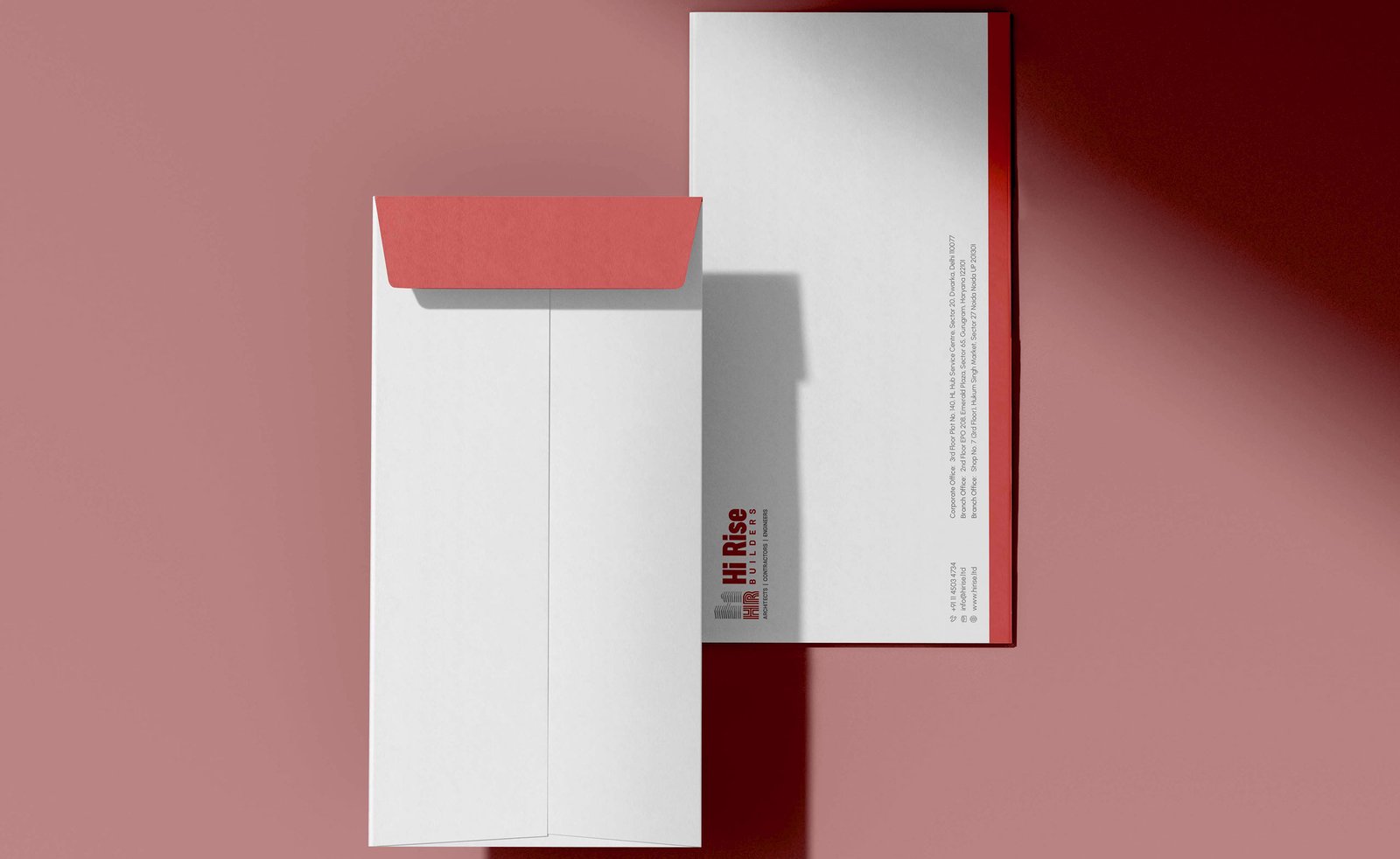
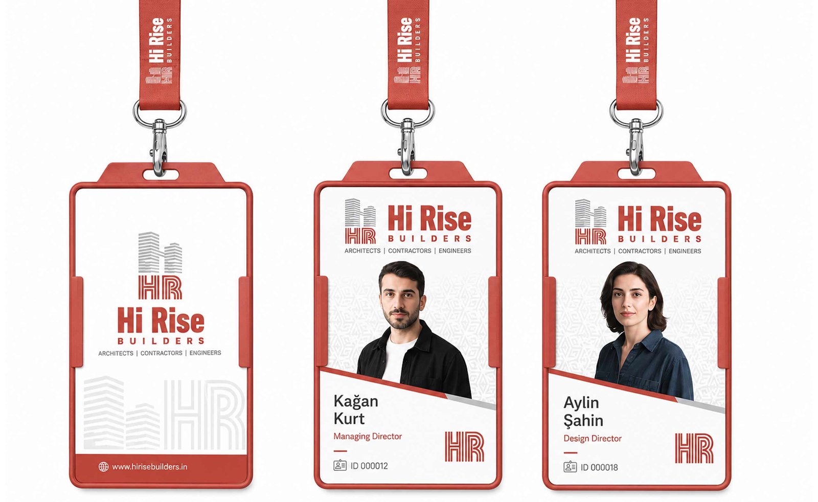
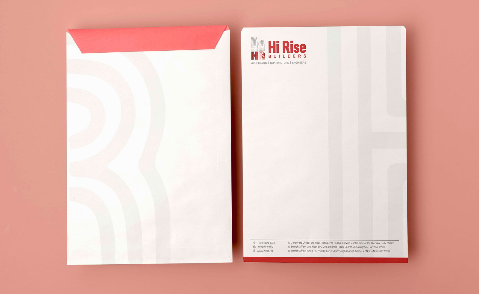
Corporate identity covered the everyday materials Hi Rise Builders’ teams use across its offices and project sites: business cards, letterheads, ID cards, and similar assets that get reordered constantly across a multi-city operation. For a firm whose pitch is “single point of accountability,” these small, easy-to-overlook items matter: a mismatched business card from a regional office undercuts the same trust the brand is built on.
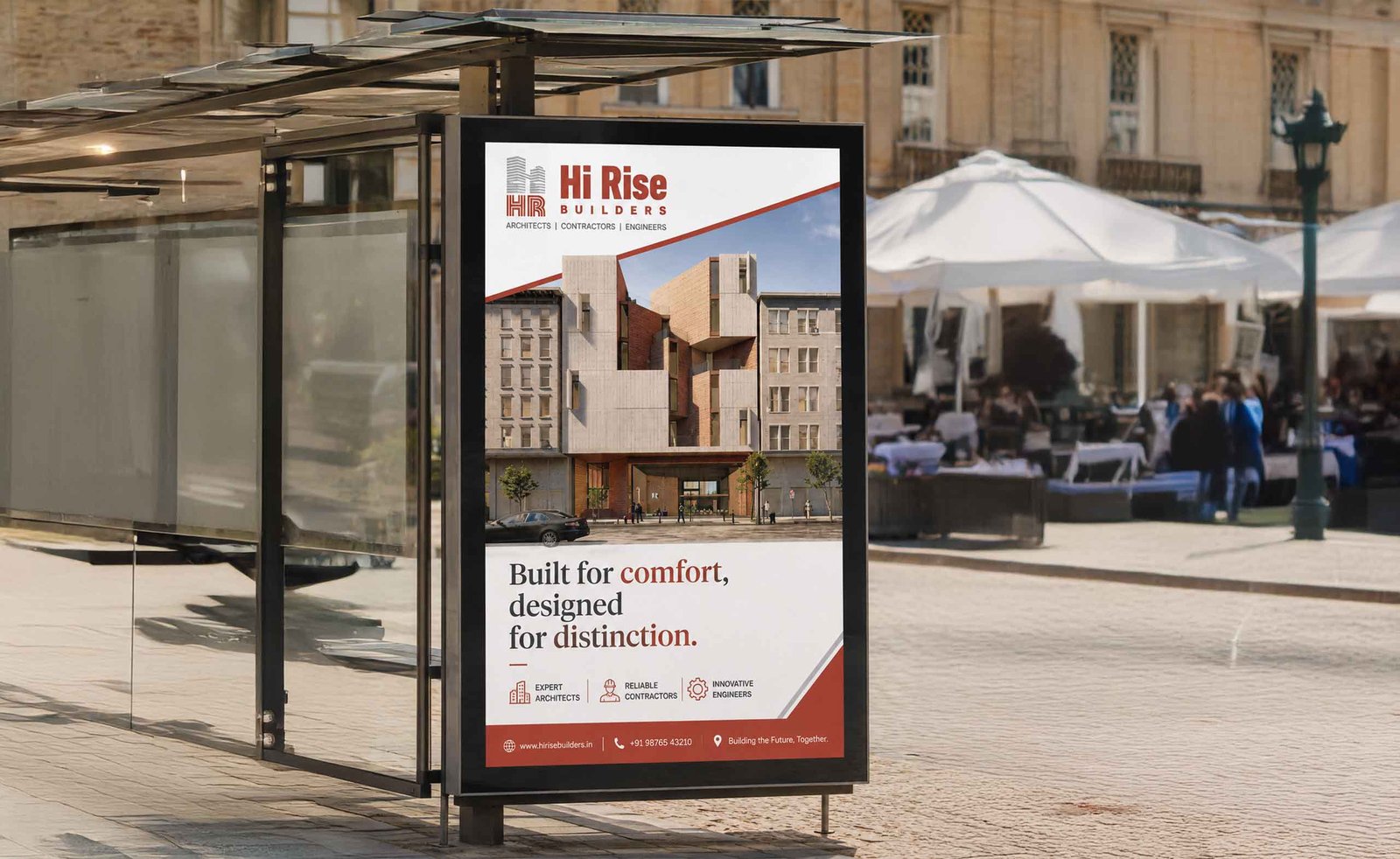
For Hi Rise Builders, site hoardings were designed as a direct extension of the brand guidelines: legible at a distance, consistent from one project site to the next, and built to reinforce the same “single point of accountability” positioning a corporate client sees in a pitch deck. Across a firm running concurrent projects in 25+ cities, this is the deliverable with the highest public visibility by far.
Space branding applied the identity to Hi Rise Builders’ own office environment: reception, meeting rooms, and internal signage, so the brand a client sees in a pitch deck matches the brand they experience walking into a meeting. For a company selling trust and accountability, an office that doesn’t visually back up that pitch is a missed opportunity, not a neutral detail.
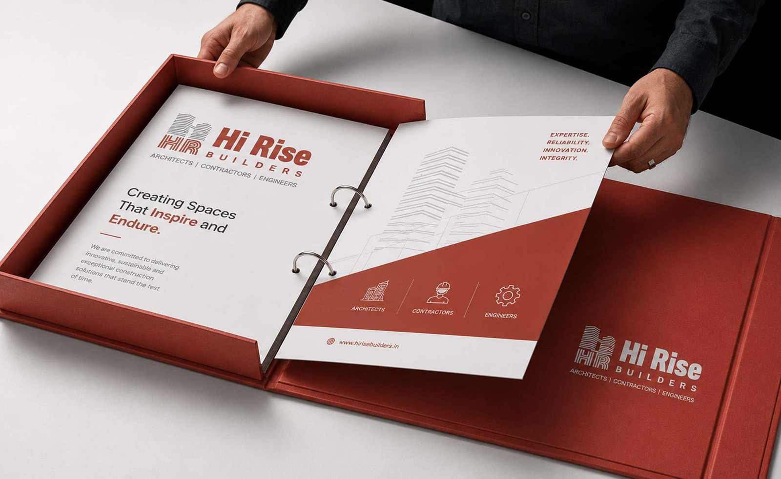
For a construction firm competing for large commercial and institutional projects, marketing material does real commercial work. It’s often the first thing a prospective client’s procurement team evaluates before a site visit or a formal pitch. This collateral was built from the same brand guidelines as every other touchpoint, so a pitch deck, a project brochure, and a site hoarding all read as the same company.
The project covered logo design, brand guidelines, corporate identity, construction site hoardings, space branding, and marketing material: a complete identity system for a pan-India construction firm.
A construction site hoarding is the large branded signage installed at an active project site. It matters for branding because it’s typically the most-seen application of a construction company’s identity, visible to the public for the entire duration of a project, in every city that company operates.
A standard logo project delivers a mark. This case study covers the full system built from that mark: guidelines, corporate identity, large-format site signage, office space branding, and marketing material, designed to stay consistent across a firm operating in 25+ cities at once.
Yes. This project demonstrates the agency’s range beyond retail and D2C branding, including large-format applications like site hoardings that most branding agencies rarely handle. See the Branding Agency in Delhi page for the full scope of services.
Hi Rise Builders’ Delhi office is at 3rd Floor, HL Hub Service Centre, Plot No. 140, Sector 20, Dwarka, New Delhi. The project was delivered by First Branding Agency’s Delhi studio at Plot 35, Sube Colony, CRB Marg, Asola, New Delhi.
Yes. The more locations, vendors, and teams that touch a brand, the more a documented rulebook matters. It’s what keeps a logo used correctly on a site hoarding in one city and a business card in another, without every application needing sign-off from the design team.
