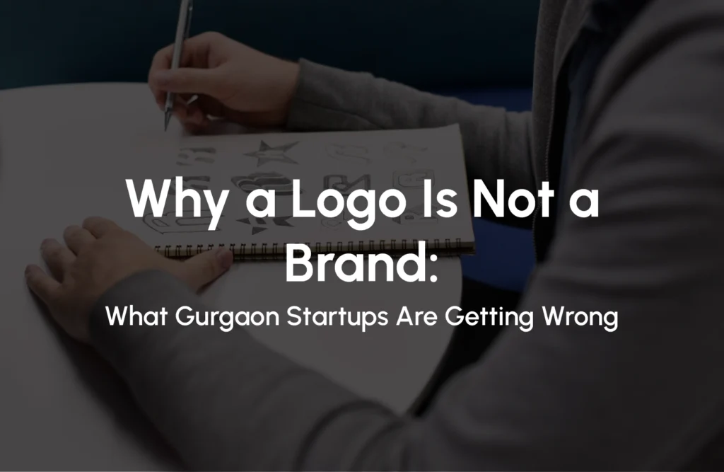
Why a Logo Is Not a Brand: What Gurgaon Startups Are Getting Wrong
Most founders in Gurgaon launch with a logo and call it branding. They pick a font, choose a colour, get a mark designed sometimes well, sometimes not and assume the brand is done. It isn’t. It hasn’t even started.
The confusion between a logo and a brand identity is one of the most expensive mistakes a growing business can make. Across India’s startup ecosystem, this gap is well-documented but in Gurgaon’s NCR market specifically, where D2C brands, fintech ventures, and service businesses compete for attention across Instagram, investor decks, and retail shelves simultaneously, the cost of getting this wrong is higher than most founders realise.
What Is a Logo?
What is a logo? A logo is a visual mark a symbol, wordmark, or combination of both that identifies a business at a glance. It is a single design element. It appears on the most surfaces, carries the most immediate recognition, and works hardest to create instant brand identification. But it is not, by itself, a brand.
Think of it this way: a logo is your name badge. It tells people who you are. It does not tell them what you stand for, why they should trust you, or how you’re different from the business next door.
What Is Brand Identity?
What is brand identity? Brand identity is the complete visual and verbal system a business uses to communicate consistently across every touchpoint logo, colour palette, typography, imagery style, tone of voice, packaging, and brand guidelines.
A brand is the sum of every interaction a person has with your business. Visual identity sets the stage, but brand essence goes deeper it is your values, your reputation, and the feeling people associate with your company. A logo is one element within that system. Brand identity is the system itself.
The Gap That’s Costing Gurgaon Startups
Most founders think they’ve done brand identity work when they’ve chosen a logo. They haven’t. They’ve completed one-seventh of the work. That remaining six-sevenths the colour system, the typography hierarchy, the imagery rules, the tone of voice, the usage guidelines is what separates a business that looks professional everywhere from one that looks inconsistent the moment it steps outside its Instagram grid.
In Gurgaon specifically, this gap shows up in predictable ways:
- A startup has a sharp logo but uses three different fonts across its website, pitch deck, and packaging.
- A D2C brand looks premium on Instagram but the same logo appears pixelated on its Swiggy Instamart listing.
- A B2B service firm has a logo on its letterhead that bears no visual relationship to its LinkedIn presence.
- A founder redesigns the logo every 18 months because ‘something feels off’ — not realising the problem was never the logo.
The logo wasn’t wrong. The brand system was missing.
5 Mistakes Startups Make When It Comes to Branding
These aren’t theoretical errors. They’re the most common patterns seen across startups in Gurgaon, Delhi NCR, and across India from early-stage founders building their first brand to growth-stage businesses wondering why their marketing isn’t converting.
1. Having a Logo Designed and Stopping There
Getting a logo made even a great one and stopping there is like building the sign for a shop and skipping the interior, the staff, and the customer experience. The sign gets people to the door. Everything else determines whether they come back. Your logo is not the only brand identity, it’s one of the many brand identity.
2. Choosing Brand Colours Without a Colour System
Most startups pick a primary colour they like. That’s not a colour system. A functional brand colour palette includes a primary colour, secondary and accent colours, neutral tones, and rules for how they combine with hex, RGB, and CMYK codes for consistent reproduction across print and digital.
Without this, your packaging manufacturer, your web designer, and your social media team will each interpret ‘navy blue’ differently. They do, every time.
3. Picking a Font Instead of a Typography System
Choosing a font for your logo is not the same as having a typography system. Brand typography defines which typeface is used for headlines, which for body copy, how sizes scale, and what rules govern readability so every piece of communication, from a business card to a billboard, feels like it comes from the same source.
4. Building a Canva Template and Calling It Brand Guidelines
Canva templates are useful tools. They are not brand guidelines. A brand guideline document defines the rules that inform the template not the other way around. Businesses that build brand from templates end up with their brand shaped by a tool’s defaults, not by their own strategy.
5. Assuming Consistency Will Happen Naturally
It won’t. Indian brands now operate across multiple touchpoints before a customer makes a decision — website, Instagram, WhatsApp, packaging, customer support, and offline experiences all shape perception. Consistency across all of these requires documentation and disciplined execution. It does not happen by feel.
What a Complete Brand Identity Actually Includes
A professional brand identity system has seven components. For Indian startups competing across quick commerce, social media, physical retail, and investor pitches all seven matter. A logo addresses the first. Brand identity covers all of them.
| Component | What It Covers |
| Logo system | Primary logo, secondary versions, icon/favicon, clear space rules |
| Colour palette | Primary, secondary, neutral tones — with hex, RGB, CMYK codes |
| Typography | Headline font, body font, hierarchy rules, sizing guidance |
| Imagery style | Photography rules, illustration style, iconography, do’s & don’ts |
| Tone of voice | How the brand sounds — formal vs conversational, language style |
| Brand guidelines | The document that holds all of the above and instructs how to apply them |
| Application examples | How the system works on business cards, social, packaging, web |
Why This Matters More in Gurgaon Than You Think
Gurgaon’s market is not forgiving about brand inconsistency. Here’s why.
The investor context. Cyber City and Golf Course Road host dozens of VC offices and accelerator programmes. Founders pitching here are assessed on how credible their business looks often before the numbers get a look. A brand that looks assembled rather than designed signals early-stage immaturity, regardless of the product.
The D2C shelf reality. Gurgaon’s D2C brands like food, health and wellness, fashion, home décor, they all compete on different platforms such quick commerce platforms, physical kirana shelves, and premium retail simultaneously. Each context has different visual demands. A logo alone cannot manage them. A brand system can.
The talent signal. Gurgaon competes for the same talent pool as Bangalore and Mumbai. A business that looks like an unfinished startup attracts startup-tier talent. A business that looks like a brand attracts people who want to build something lasting.
Research shows that brand identity isn’t just about a logo it encompasses everything customers experience and perceive about your business. Having consistency in your brand presentation help your revenue by up to 20 percent.
When Does Your Startup Need Full Brand Identity vs Just a Logo?
Not every business needs the full branding on day one. Here’s an honest guide.
A logo alone is enough if:
- You’re validating a concept before committing to a brand direction
- You’re running a pop-up, event, or short-term project
- You’re pre-revenue and need to test the market with minimal investment
You need full brand identity when:
- You’re raising a seed or Series A round and need investor-ready collateral
- You’re going to retail, quick commerce, or modern trade
- You’re building a team and need to communicate brand standards internally
- You’re spending on paid marketing brand inconsistency at scale costs conversion
- You plan to license, franchise, or expand to new cities across India
If any of these apply to your business right now, a logo isn’t enough. You need a system.
